Conference

The central event of the 2023 Typographics festival is a con­fer­ence with speakers from around the world, focused on the contem­porary use of type. It takes place June 16–17 at Cooper Union in New York City.

The main Typographics conference will feature an international line-up of designers, with presentations about type and its use in graphic design, web design, publication design, book design, packaging, branding, corporate identities, advertising, motion graphics, and more.

Speakers, talk descriptions, and other details will be posted here over the coming weeks. For updates and announce­ments, join the Typographics mailing list and follow Typographics on Mastodon, Twitter, and Instagram.

See ticket info

Jonathan Barnbrook

Designing Bowie

In Bowie’s adopted town of New York, Jonathan Barnbrook, will for the first time be talking about his long-term collaborations with David Bowie that explore the intersection of music, design, and symbolism. Barnbrook will delve into the design of the Bowie albums The Next Day and Heathen, and Blackstar for which he earned a Grammy Award. He will also discuss his role in the exhibition David Bowie Is and focus on the pivotal role that typefaces and typography play in enhancing the experience of music. (He may also do a rather poor impression of David Bowie at some point in the talk too).

About Jonathan Barnbrook
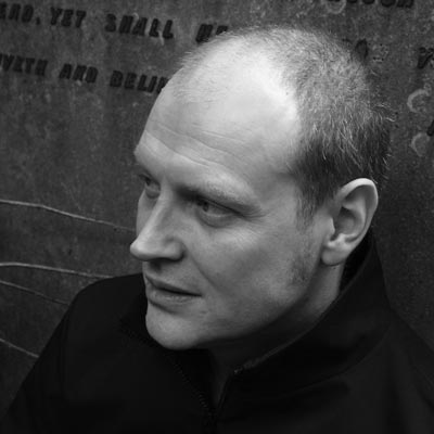
Jonathan Barnbrook

Since graduating in 1990 from Saint Martin’s School of Art and the Royal College of Art in London, Jonathan Barnbrook has developed a multifaceted practice that includes activism, graphic design, typeface design, industrial design and motion graphics. In 1997 he established his own font company VirusFonts. In 2010, his most famous typeface ‘Mason’ released by Emigre in 1992 became one of the first digital type acquisitions of the Museum of Modern Art, New York. Collaborations have included Damien Hirst – for whom he designed the ground breaking monograph I want to Spend…, Activism with Adbusters and the Occupy movement – and most notably David Bowie, working on all of his album cover designs from Heathen in 2002, to his final release Blackstar in 2016. In 2007, his contribution to British graphic design was recognised with a major retrospective exhibition at the Design Museum, London and Ginza graphic Gallery, Tokyo entitled Friendly Fire. A monograph of his work Barnbrook Bible was simultaneously published by Booth-Clibborn Editions. He has been nominated twice for a Grammy for his record cover designs, winning one for the David Bowie album Blackstar.
barnbrook.net
@barnbrookstudio
@barnbrookstudio

Lavinia Lascaris

Typography and Language in Exhibition Design

Exhibitions are portals into a theme—dynamic iterations of a central idea within a defined space. By carefully considering the theme’s nuances, historical references, and linguistic patterns, typography becomes a tool for building a frame around the theme, allowing designers to shape the narrative, create visual coherence, and guide the viewer’s experience. Lavinia will unravel the process of designing typography-driven identities crafted specifically for exhibitions while considering their implementation within the space and will illustrate instances where the identity itself can inspire the development of new typefaces. She will also delve into linguistic studies from both historical and contemporary references and their role in proposing exhibitions that embrace the playfulness of language.

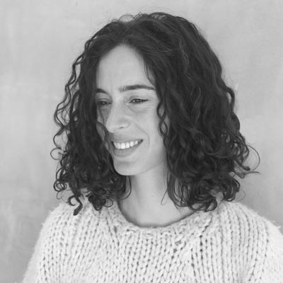
About Lavinia Lascaris

Lavinia Lascaris

Lavinia Lascaris is a graphic designer from Greece whose area of specialization is spatial and publication design with a focus on typography. Her work concentrates on research and conceptual development that often comments on social and cultural matters. Her background is in fine art (primarily sculpture and photography) and dance. She has lived in Athens, London, Paris, Pondicherry, Barcelona, and Los Angeles, collaborating as a designer and artist with museums and galleries. Lavinia received her MFA in graphic design at ArtCenter College of Design in Pasadena. She was awarded the Typography Fellowship from Hoffmitz Milken Center for Typography (HMCT) in 2018, after which she was offered her current position of Exhibition and Graphic Designer at the Center. Lavinia’s work has been recognized by Type Directors Club (TDC), Communication Arts, GDUSA, and IDA Design Awards.

lavinialascaris.com
@lavinialascaris
@lavinialascaris

J. Dakota Brown

Typography and Automation from the Linotype to A.I.

Recently, the design press has been abuzz with speculations about a coming wave of technological “disruption.” Will algorithms and smart machines sap our skills, cheapen our work, or even eliminate it altogether? Or will they open up new platforms for creative social engagement? Such questions, as unprecedented as they may seem, have in fact been central to the typographical tradition. As a craft born in the mass-production mechanism of the printing press, typography has always been implicated in automation — raising thorny questions about industrial innovation, economic growth, and the dignity of work. In this rapid-fire history of nearly 150 years of changing techniques and technologies, Dakota will offer a broader perspective on the present and future of typographical practice.

About J. Dakota Brown

J. Dakota Brown

In 2000, J. Dakota Brown graduated from NC State University’s College of Design and was awarded a student medallion from the AIGA. He has lived in Chicago ever since, designing books and journals, pursuing two graduate degrees, and teaching on the history and theory of art, design, and labor. In 2019 he published two pamphlets, The Power of Design as a Dream of Autonomy (The Green Lantern Press) and Typography, Automation, and the Division of Labor (Other Forms Books). Both publications drew on his dissertation research in Northwestern University’s Rhetoric and Public Culture program. Dakota successfully defended his dissertation last spring; he currently teaches at the University of Illinois Chicago and the School of the Art Institute of Chicago.

jdakotabrown.net
@JDakotaBrown
@marks_n_angles

Ximena Amaya

Typographic Emergencies: Imagining through Letterforms

Language is an extension of oneself, it has the potential to change and expand the way we feel and the way we experience the world. In design, typography, in a similar manner, can affect the meaning of a word beyond its original function and beyond its rationality, it can shape how we experience language. In this talk, looking at references from the history of letterforms, street vernacular, and new technologies related to my personal practice and portfolio, we’ll see how thinking about typography as a speculative tool rather than just a functional one, can be leveraged to help us imagine and design for either experimentation, custom fonts or graphic design projects in general.

About Ximena Amaya

Ximena Amaya

Ximena is a graphic designer from Mexico City now residing in Los Angeles, California. Always driven by curiosity, with a focus on typography and its many uses, her practice ranges from traditional print media to exhibition design. She graduated from ArtCenter’s Undergraduate Graphic Design program and is currently serving as Typography Fellow at Hoffmitz Milken Center for Typography (HMCT). Among her participation and recognitions are the Type Directors Club (TDC) Beatrice Warde Scholarship in 2021, sponsored by Monotype; interning at Pentagram Design, New York for Natasha Jen; and the HMCT Hispanic Women of Typography Award in 2022.

ximena.works
@ximenaamayac

Craig Ward

On Process and Perseverance

Ward will address the various processes – physical, generative, organic, and otherwise – at the heart of his personal projects; the visual tension they bring to the work; and the ways he has managed to incorporate that approach and thinking into commissioned pieces and brand projects. Moreover, it has informed the thinking behind the generative font foundry he is launching this summer which presents a total rethink of the type design process.

About Craig Ward

Craig Ward

Photo: Steven Brahms

Craig Ward is a highly decorated Design Director and creative leader with interdisciplinary experience at the highest level across myriad verticals spanning music, the arts, fashion, beauty and technology. Brand architect and creative partner to the likes of Calvin Klein, Aesop, Kings of Leon, Zoom, Verizon and The Wall Street Journal amongst others, he is nonetheless best known for his pioneering typographic works. Exhibited globally and profiled by New York Magazine and Fast Company, Ward’s work has featured on the covers of TIME magazine, Creative Review, The Washington Post and WIRED as well as on the England national team football kit and countless ad campaigns.

ward.studio
@MrCraigWard
@mrcraigward

Muk Monsalve

Two to Tango

After my formal education as a Type Designer finished, I noticed that the way I saw and thought about type had changed forever. I also realized that diving more into type had made me a stronger graphic designer. This fact has reshaped the way I produce type in my personal practice, and at the same time, how I approach my graphic design work. The bond between Type and Graphic Design is indestructible, intricate, and fundamental, a dance. The type I produce, why I make it, and the projects/pieces where they live, fuel and inform constantly the way I design and build type. This idea allowed me to work with type as a concept, as a means of communication but also as a tool. This talk explores how these two practices push each other in my daily work, making it stronger.

About Muk Monsalve

Muk Monsalve

Muk Monsalve is a graphic and type designer from Buenos Aires, Argentina. Passionate about letter making, she also teaches how to use them and make installations with them at the University of Buenos Aires (FADU) and in the National University of Arts (UNA). She loves materials and experimentation, and that’s how Defrenéticas was born were she makes huge letter installations, and curates type-walks around Buenos Aires. Her latest adventure is making typographic scarves and cover ups at @musadelasfalto. She got her BA in Graphic Design at The University of Buenos Aires (FADU) and her MA in The Netherlands at the Royal Academy of Art, KABK.

mukamonsalve.com.ar
@Muk@typo.social
@Defrenticas
@mukmonsalve

David Jon Walker

A Typographic Evolution

Early aesthetic influences resurface as David takes us for a walk of his typographic explorations that have expanded his use of form and application. The investigation of historical artifacts, architectural elements, and environmental recognition provide a never-ending supply of inspirational material for letterform design.

About David Jon Walker

David Jon Walker

David Jon Walker is a Graphic Designer and Associate Professor of Art in Graphic Design at Austin Peay State University. He is also principal of Rhealistic Design, a design consultancy that is active locally and nationally. As a sought-after creative, David works with national political candidates, PACs, large non-profits, governmental entities, and varying businesses lending his talents to their marketing efforts to increase awareness and further campaigns. He examines social cues and the historical past to shape the aesthetic of his visual voice for personal lettering projects with fun and intention. His award-winning works have been recognized by Graphic Design USA, Campaigns and Elections, the International Association of Business Communicators, AIGA, Typism, and the College Media Association. He is currently pursuing a MFA in Graphic Design with a focus on letterform and typography at Yale School of Art.


@david_jon
@davidjonwalker

Suzy Chan

Typography, Language, and Cultural Narrative

Suzy Chan moved from mainland China to Macau when she was a teenager, to London in her early 20s, and to Germany when she was 26. It can be said that she almost spent her life experiencing cultural conflicts represented by language. Language can be a bridge of cultural communication, of course, it can also be a bridge that causes misunderstanding, discrimination, and even hatred.

From the billboards outside the factory in an urban village in Guangzhou, China, to the golden typography of the Venetian Casino in Macau; from the small advertisements with crowded typefaces pasted on the telephone booths of the Elephant Castle in London to the long German words in Germany that she couldn’t understand, she connected these memories and formed her special cultural attitude. In this talk, Suzy Chan will share her observations about typography, language, and cultural narrative in these places. And explain how these experiences inspired her work at different times.

About Suzy Chan

Suzy Chan

Suzy Chan is a designer and visual artist who grew up in Macau and Guangdong, China, studied at UAL LCC in London, and currently lives and works in Germany. As a designer she makes posters, moving images, videos; Also specializes in brand expressions, and likes to work with factories to make products; As a visual artist, she paints, creates visual arts, makes stuff of different shapes and materials, uses design as a tool of art expression, and cares about the world.

suzychan.com
@suzychannnn

Inês Ayer

Call to Action: Unlocking Advocacy Through Type

How typography can lead the way to convey impactful stories? A 20 minutes journey to explore how causes like social justice, health equity, democracy, and sustainability can be shaped by a compelling letter narrative.

About Inês Ayer

Inês Ayer

A humanist designer with a 360º approach to problem-solving. Inês uses design as a society shifter. She graduated in 2016 from the Faculty of Fine Arts of the University of Lisbon in the Communication Design course, where in the final year she was part of the development team of the finalist exhibition and collaborated with the atelier TVM designers. In 2017 she left for Berlin to do an internship at Superunion. After this period in Germany, she decides to embark on a volunteer project at a school in Thailand. On her return to Portugal, she came back with greater motivation to invest in new social initiatives such as Decoding Creativity Barcelona, High Potentials ADCE, The Design Kids Lisbon, OFFF Academy powered by Adobe, Próxima Geração Apolitical Academy, Girls in Tech Columbia University and United Nations SDG. Programs that influenced and defined her path to building her independent design atelier, founding Studio Ayer in 2019, a practice that in 3 years of existence has already collaborated with 12 countries in building +80 projects. She holds an MFA in Design Entrepreneurship from the School of Visual Arts.

Currently, she is based in New York where she is also developing project Aliquoti, focused on reducing neonatal mortality for BIPOC women in the U.S. She keeps her scope of interests broad with a keen interest in culture and engineering biotech. Advocating to generate discussions about democracy, climate change, and social equity.

inesayer.com
@ines_ayer

Rob Stenson

A Font is a Percussion Instrument: Animating Letters with Sound, Animating Sound with Letters

This talk will focus on the relationship between type and music within film and video. Through case studies, Rob will present work that combines sound, typography, and variable fonts. He’ll also share some of the inspirations behind things he’s designed, like the work of the title designer Jean Fouchet and the artist Len Lye.

About Rob Stenson

Rob Stenson

Rob Stenson is a designer-musician based in Monrovia, California. After studying architectural history at Columbia University, Rob worked for a time as a programmer in San Francisco before starting Goodhertz, Inc., an audio software company, where he currently works on audio plugin interfaces, a programming library called Coldtype, and lots of videos that combine typography and music. Rob also plays clawhammer banjo, enjoys looking at buildings, and would love to talk to you about replacing your gas appliances with electric ones.

robstenson.com
@robstenson@mastodon.design
@robstenson
@robrushstenson

Eddie Opara

Regenerative Narrative(s)

The intentional crafting of type designs that fulfill not only their utilitarian purpose of facilitating communication but also assimilates into a grander narrative. Imbued with historical undertones, societal and cultural symbolism, and an unparalleled artistic beauty that encompasses a progressive and forward-thinking discourse. This approach ultimately leads to a deeper and more dynamic interconnectedness between the form and content of the message being conveyed.

About Eddie Opara

Eddie Opara

Eddie Opara was born in Wandsworth, London in 1972. He studied graphic design at the London College of Printing and Yale University, where he received his MFA in 1997. He began his career as a designer at ATG and Imaginary Forces and worked as a senior designer/art director at 2×4 before establishing his own studio, The Map Office, in 2005. He joined Pentagram’s New York office as partner in 2010. Opara is a multi-faceted designer whose work encompasses strategy, design and technology. His projects have included the design of brand identity, publications, packaging, environments, exhibitions, interactive installations, websites, user interfaces and software, with many of his projects ranging across multiple media. Opara is a senior critic at the Yale University School of Art. He has taught at the Rhode Island School of Design, the Columbia University School of Architecture and the University of the Arts, Philadelphia. He is a member of the distinguished design society, Alliance Graphique Internationale. Opara recently authored a book, Color Works, published by Rockport. He was named one of Fast Company’s 100 Most Creative People in Business in 2012 and 2014, and was featured in Ebony magazine’s Power 100 and Adweek’s Creative 100.

pentagram.com

Gabriela Namie

Humming in UPPERCASE

In “Humming in UPPERCASE”, Gabriela Namie will walk through some of her selected projects to discuss being an outsider in tech, music, and how her type design background influences her design work.

About Gabriela Namie

Gabriela Namie

Gabriela Namie is a Brazilian designer and Art Director based in New York City. She works at Google as YouTube Music’s Art Director. Her background in graphic and type design influences her to connect culture to scalable visual systems. She has previously co-founded Estúdio Barca in São Paulo and worked as a Senior Designer at Sagmeister & Walsh. She was nominated a Young Gun in 2021 and her work was recognized by different awards and countries, including Latin American Awards, London International Creative Competition, the Brazilian Graphic Design Biennial, etc.

gabrielanamie.com
@gabrielanamie

Ben Grandgenett

Issues

After 10 years and over 500 issues at The New York Times Magazine, Ben Grandgenett will examine the process of developing typographic identities and art direction for special issues of the magazine and the iterative attempt each week to make something new for a 126-year-old weekly general interest publication.

About Ben Grandgenett

Ben Grandgenett

Ben Grandgenett is the design director of The New York Times Magazine and a graphic designer based in Brooklyn. He was previously an instructor of graphic design at the School of Visual Arts in New York, from which he graduated in 2013. Ben, who is originally from Wahoo, Nebraska, was recognized as an Ascender by the Type Directors Club in 2019, and as a Young Gun by the One Club for Creativity in 2017. His work has also been honored by the Art Directors Club, Creative Review, D&AD, Graphis, the Society for News Design, and the Society of Publication Designers.

bengrandgenett.com
@bengrandgenett
@bengrandgenett

Ying Chang

Flowing in Letters: A Constant Pursuit of Tranquility Within Shapes and Space

In between each stroke, there lies the negative space. The relationship between these two elements, as well as within themselves holds great significance in determining the overall aesthetic and personality of a lettering piece. Understanding the principles of negative space and visual weight is key to creating a well-tailored, balanced, and harmonious lettering piece that allows the eye to flow naturally across the page, communicating the message with a memorable impact.

In this talk, Ying will not only share her process and tips but also how this practice has contributed to her philosophical shift and shaped the way she lives and exists in the world.

About Ying Chang

Ying Chang

After taking her first few calligraphy classes, Ying was inspired to enroll in Type@Cooper in 2014 where her passion for lettering came into focus, and she hasn’t put the pencil down since. She has been creating logotypes and lettering works for a range of brands, publications, and campaigns while being recognized and published by a variety of organizations. Along her journey with type, Ying has been guided by numerous kind and passionate teachers—so when offered the opportunity to teach her own workshop, she was determined to be just like those who have lifted her up. Witnessing the growth in others not only makes her heart smile, but also widens her views and teaches her precious lessons about herself. Nowadays, Ying focuses on self-initiated projects, sharing her knowledge in the form of workshops and lectures. She also continues her role as Design Director in the world of advertising, where she has been producing award-winning campaigns. Ying recently gave up her worldly possessions to live as a nomad. She plans to bring her workshops wherever she goes, and is looking forward to meeting other letter lovers during her travels. Catch her if you see her in town!

yinglish.net
@yinglish

Faride Mereb

Transformed by the Tropics: Migration and Visual Cues in Venezuelan Design

Faride Mereb will discuss how hybridity is woven into Venezuela’s visual cultural landscape through the work of two graphic designers: Karmele Leizaola (1929–2021) and Víctor Viano (1939–2000). She will explore how their editorial work in state-funded publications, independent magazines, and various typographic outputs have been influenced by migration, political context, and local aesthetics.

About Faride Mereb

Faride Mereb

Photo: Tim Soter

Faride Mereb is an award-winning Venezuelan book designer, art director and researcher currently based in New York City. Her Caribbean and Middle Eastern heritage and a profound love of books have deeply influenced her work, giving it a hybrid nature. She holds ongoing artistic collaborations in Latin America and Europe. Mereb won the 10x10 Women in Photo-books Research Grant in 2022 with her project on Karmele Leizaola, while also doing research for a year at Columbia University as a Visiting Scholar. She currently directs the design studio and archival research center Letra Muerta INC.

faridemereb.com
@FMEREB
@fmereb

Beatriz Lozano

The Dimensionality of Type: Reimaging Letterforms through Technology

In recent years emerging technologies have created new possibilities for how we can create letterforms, from serving as tools to generate unlimited ideas along the design process to adding layers of interactivity to our final designs. In this talk, Beatriz Lozano will share some of her recent typographic projects that were designed using creative coding, augmented reality, and artificial intelligence. Through these projects, we will explore how we can embrace, adapt, and harness technology for good and the possibilities it provides when designing for communities that are often overlooked.

About Beatriz Lozano

Beatriz Lozano

Beatriz Lozano is a designer, typographer, and educator exploring how technology can push typography to exist at the intersection of the physical and digital world. She teaches interaction design at Parsons and was formerly a design director at Sunday Afternoon. Originally on the path to becoming a mechanical engineer, Beatriz shifted to graphic design as her involvement in immigrant rights activism exposed her to the power of visual communication. Her work has been recognized by the ADC, TDC, Communication arts, and PRINT. In 2022 she was awarded the Art Directors Club Young Gun Award, which recognizes the world’s best creatives under the age of 30. Some of her clients include ESPN, Target, and NPR.

beatrizl.com
@beatloz

Tasheka Arceneaux-Sutton

A Historical Survey of Typography by Black People in America

Despite the limited availability of information, Black designers have made notable contributions to graphic design, and their work in type creation has yet to receive adequate attention and study. This presentation emphasizes the correlation between Black designers and the realm of typography, lettering, and calligraphy. The discussion will showcase a range of works across diverse industries, including publishing, music, film, activism, commercial products, and more, from the late 1800s to the present. The objective is to reveal the untold stories that have shaped the dynamic landscape of Black graphic design history, with a particular focus on the role of typography.

About Tasheka Arceneaux-Sutton

Tasheka Arceneaux-Sutton

Tasheka Arceneaux Sutton is an educator, graphic designer, image-maker, and writer. She is an Associate Professor of Design and Creative Technologies and a faculty in the M.F.A. program in Graphic Design at Vermont College of Fine Arts. She is the founder of Blacvoice Design, a studio specializing in branding, electronic media, identity, illustration, and publication design. Typography has a strong presence in her work—hand-lettering, typesetting, and deconstructing type through analog and digital processes. Tasheka’s research focuses on discovering Black people omitted from the graphic design history canon. She’s interested in the visual representation of Black people in the media and popular culture, primarily through the lens of stereotypes. Her essay, “A Black Renaissance Woman: Louise E. Jefferson,” is in Baseline Shift: Untold Stories of Women in Graphic Design History. Her essay, “The Type Behind the Name,” in Documenting the Nameplate, is forthcoming in 2023. She is co-author of Black Design in America, which will be released in 2023/24. Tasheka holds an M.F.A. in graphic design from California College of the Arts and a BA in English Writing from Loyola University New Orleans.

blacvoicedesign.myportfolio.com
@blacvoice
@blacvoice

Pascal Zoghbi

Arabic Bold Nr.49

Planning the next Arabic typeface requires historical research, analysing the current type market, and understanding the latest font technology dedicated to the Arabic script. Pascal Zoghbi, an Arabic type designer and founder of 29Letters Type Foundry (aka 29LT), will take us behind the stage of the production of contemporary fonts and the criteria required to achieve such a task professionally. He will try to demonstrate the mindset of a type designer amidst the crucial transition phase after finishing a type system and the initiation of a new one. Historical calligraphic and typographic references will be showcased during the talk in order to give an overall perspective of the Arabic type developments and market throw out the decades.

About Pascal Zoghbi

Pascal Zoghbi

Pascal Zoghbi is a Lebanese designer and educator with a Master of Design in Type & Media from KABK. He founded 29LT digital type foundry in 2013. Building on a cross-cultural approach, he has developed an outstanding collection of contemporary multiscript typefaces. Having moved to Madrid in 2018, he expanded 29LT’s focus on Arabic and Latin scripts to embrace a global multiscript approach that taps into other world scripts. Zoghbi taught for ten years at various design schools in Lebanon and in the UAE. Internationally renowned, he has received prestigious design awards, such as TDC, Granshan, AIGA, and was nominated for Jameel Prize 3. He also co-authored and edited the Arabic Graffiti book.

29lt.com
@29Letters
@29letters

L.A. Corrall

Typography and Storytelling

Storytelling is an integral part of the work we do, not only as type designers, but as designers in general, and especially as brand designers. At COLLINS, storytelling is an essential skill. Not only does it help our clients find greater significance in their own brands, but it also provides a compelling means of communicating why we’ve made specific design decisions. In this talk, L.A. will walk through a few COLLINS case studies to reveal the stories and deeper meaning behind the typography. He also plans to share some personal work and a story about how he accidentally stole something from Matthew Carter.

About L.A. Corrall

L.A. Corrall

L.A. Corrall (FKA L.A. Hall) is a Filipino American designer who is currently VP, Creative Director at COLLINS in New York. His work has been recognized by D&AD, ADC, Communication Arts, Webby Awards, AIGA and HOW among others. L.A. is a multidisciplinary designer with over 15 years of experience primarily in brand identity as well as product design. He has international experience from San Francisco and New York to London and Abu Dhabi, working with Wolff Olins, Mother Design, R/GA, DesignStudio, JKR, Gretel, Red Antler, SYPartners, Elephant, Landscape, SS+K and Method. He has worked with clients including: Robinhood, Nike, YouTube, Apple, Google, Microsoft, Facebook, Pepsi, Samsung and AIGA. L.A. holds a BFA from the Rhode Island School of Design, and is the recipient of the Bo Bernstein Award for Degree Project.

lacorrall.com
@la_corrall
@lacorrall

Sagi Haviv

Type as Icon

Language and type are primary tools of human communication. Making them the focal point of a trademark design opens opportunities for powerful expression. Through case studies, Sagi Haviv will demonstrate this discipline and the key role that typography plays in the practice of crafting an icon.

About Sagi Haviv

Sagi Haviv

Sagi Haviv is a partner and designer at Chermayeff & Geismar & Haviv, the firm responsible for many of the most famous logos of all time, including Chase Bank, NBC, Conservation International, Harvard University Press, State Farm, Mobil Oil, PBS, Showtime Networks, NYU, National Geographic, Animal Planet, the U.S. Open Tennis Championships, and most recently the U.S. Olympic & Paralympic Museum and Warner Bros. Discovery. Sagi joined the firm in 2003 after graduating from The Cooper Union School of Art. He is a go-to expert on the process of effective logo design for Bloomberg Businessweek, PBS, Fast Company, NBC’s Meet The Press and SkillShare. He speaks about logo design around the world, including for TEDx, the AIGA, the HOW Design Conference, the Brand New Conference, Princeton University, the Onassis Foundation, the American Advertising Federation, and Columbia Business School, amongst many others. He teaches Visual Identity Design at the School of Visual Arts in New York City. Sagi is coauthor of Identify: Basic Principles of Identity Design in the Iconic Trademarks of Chermayeff & Geismar (Print Publishers, 2011) and Identity: Chermayeff & Geismar & Haviv (Standards Manual, May, 2018).

cghnyc.com
@cghnyc
@chermayeff_geismar_haviv

Register

Registration for the main Typographics 2023 confer­ence is now open, with options to attend both in-person and virtually online

Conference registration is separate from the workshops and TypeLab. You must register for those events separately.

Pricing

Professional$500Standard tickets for professional attendees.
Educator$425For college staff, instructors, adjuncts, professors, and public library librarians.
Student$275For full-time matriculated students currently enrolled in college. Please be prepared to show valid student ID card at check in.
Small bundle$425For 5–9 professional tickets. These tickets are non-refundable but may be transferred to another person if requested before May 30.
Large bundle$400For 10 or more tickets. These tickets are non-refundable but may be transferred to another person if requested before May 30th.
“Pay What You Can” livestream tickets$0–100These tickets provides access only to the online livestream for the conference and support our efforts to make events accessible remotely.
Register for conference tickets through Eventbrite

Please note: Typographics participants are subject to our Code of Conduct & Policies. If you do not agree to these conditions, do not register or attend any Typographics events.

Stay Updated

More info about this year’s Typographics will be announced in the coming weeks.

Join the mailing list to get the latest news and announcements:

Also follow Typographics on Mastodon, Twitter, and Instagram.

Sponsors

We’re grateful to have the support of some of our favorite organi­zations. Without their generosity, Typographics would not be possible.

Interested in sponsoring? Write to type@cooper.edu

Presenting Partners

The Cooper Union Type@Cooper The Herb Lubalin Study Center

Gold Sponsors

Monotype

Silver Sponsors

Adobe Commercial Type Production Type Klim Type Foundry Frere-Jones

Lead Sponsors

Dual Type TYPETR Universal Thirst HEX Projects Maryland Institute College of Art Business Letters

Brass Sponsors

Font of the Month Club Occupant Fonts Typotheque The Metropolitan Museum of Art Remote Marketing Team Vermont College of Fine Arts XXIX Spaghetype Sharp Type 29Letters Pentagram Brooklyn Brewery

Pixel Sponsors

OH no Type Co. TypeTogether XYZ Type John Downer Darden Studio Society of Scribes Ina Saltz Scout Books DSType foundry Fontstand Process Type Foundry Emigre Fonts Arrow Type Emtype Cast Type Foundry Zetafonts Foundry CJ Type Fort Foundry Just Another Foundry NFType Jamra Patel Blackletra Hoffmitz Milken Center for Typography Proof&Co. Fontdue MCKL TIGHTYPE Order Type Foundry Leinster Type

Association & Media Partners

Fonts In Use Eye Magazine TYPE01 Typographische Gesellschaft München

Interested in sponsoring? Write to type@cooper.edu